Vehicle Panoramic Display
User Interaction Design and Research
Client:
American Luxury Automaker
Role:
UX/UI Designer
Research Moderator
Year(s):
2017-2019
Challenge
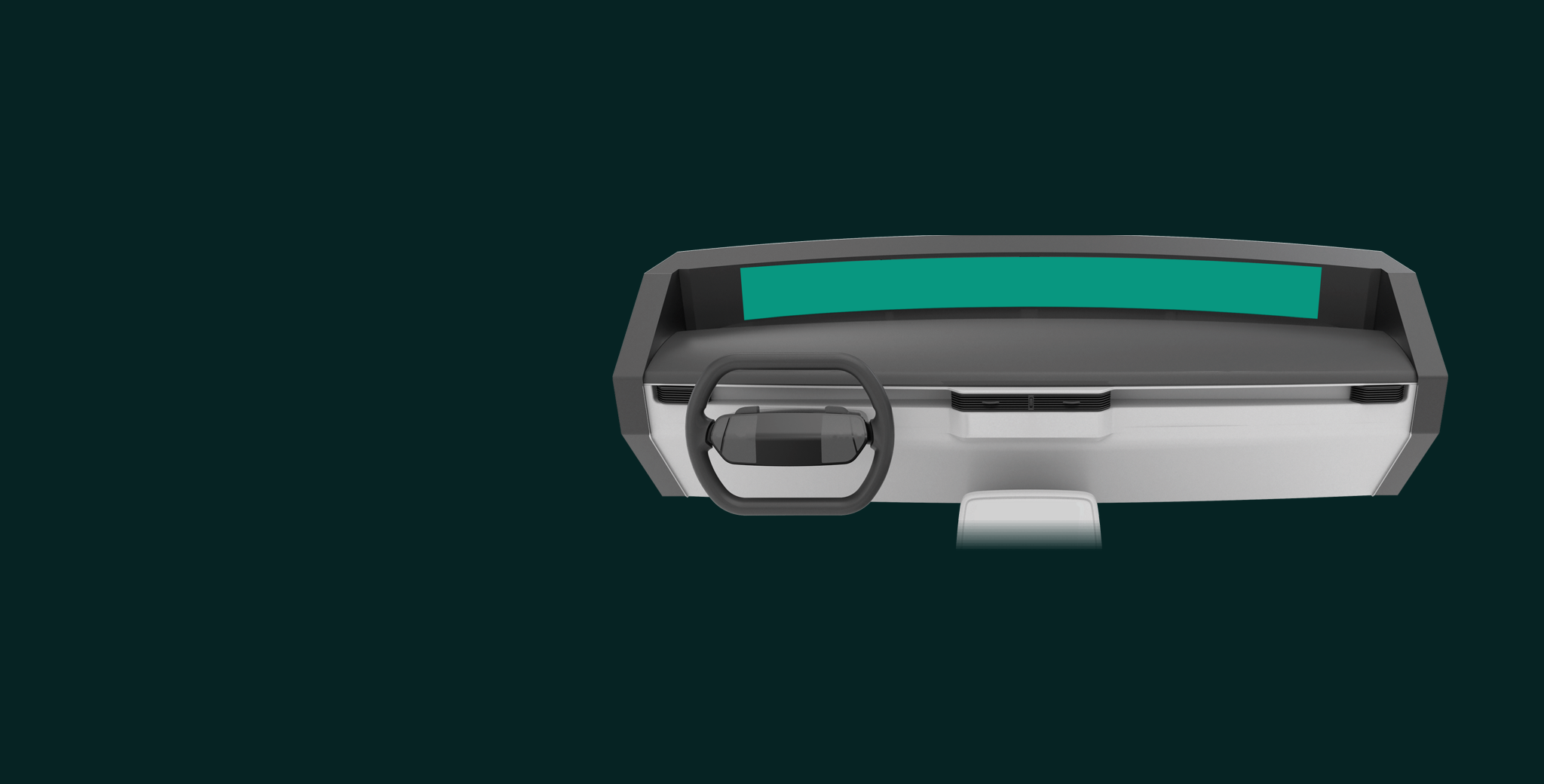
Find a usable and worthwhile purpose for a wide, panoramic heads up display that sits at the base of a vehicle windshield. It needed to be more than just novel; it had to provide a distraction-free experience and, above all, make drivers feel safer.
Primary Goal 1How can a screen of this size be valuable and desirable to their customers? What’s the right amount of content it should contain?
Primary Goal 2What is the most natural method of interaction for a display of this size and location?
We first tested three interaction methods of hardware that were already reasonably available to the client. We paired these with the panoramic display in simulated driving scenarios.
The simulated setup for testing our interaction methods and design work with users.
Concept 1 Center Console Knob
Menu button opens horizontal “App Switcher”
Turning knob scrolls through menu items
Pressing the knob selects an item
Destination entry is done via mobile device and sent to vehicle interface
Concept 2 Gesture Pad
Two finger downward swipe reveals app switcher
Single finger up/down/left/right moves the focus/highlight
Tap dives deeper into menu and content
Destination entry through alphabetical scribe
Concept 3 Steering Wheel D-Pad and Buttons
Second zone of the screen acts as an “interaction region”. Using the left and right arrows, users move a top aligned highlight to hover over navigation or other application across the screen width. Pressing the OK button brings that content into the interaction region
Up/Down buttons scrolls vertically through lists and menus
Home button brought user to top level menu of active application
Destination input via voice button
Concept 3 Expanded
Content Architecture
Default Driving Screen
Right arrow to highlight Audio App
“OK” button to select Audio App into Zone 2
People were very excited about this display screen. They liked that it kept their eyes on the road and allowed them to do simple downward glances for information, rather than a larger, in-cabin shift of their eyes towards a center console while driving.
ResultsWhile the gesture pad was the most preferred interaction of the three, none of them felt particularly seamless or safe to participants. Many participants brought up or asked about a voice-first interface.
This first user experience study shed light on the fact that a remote control aspect (controlling a moving highlight) was not the best way to approach this type of screen.
One Year Later…
User workshop to understand desired placement of content types
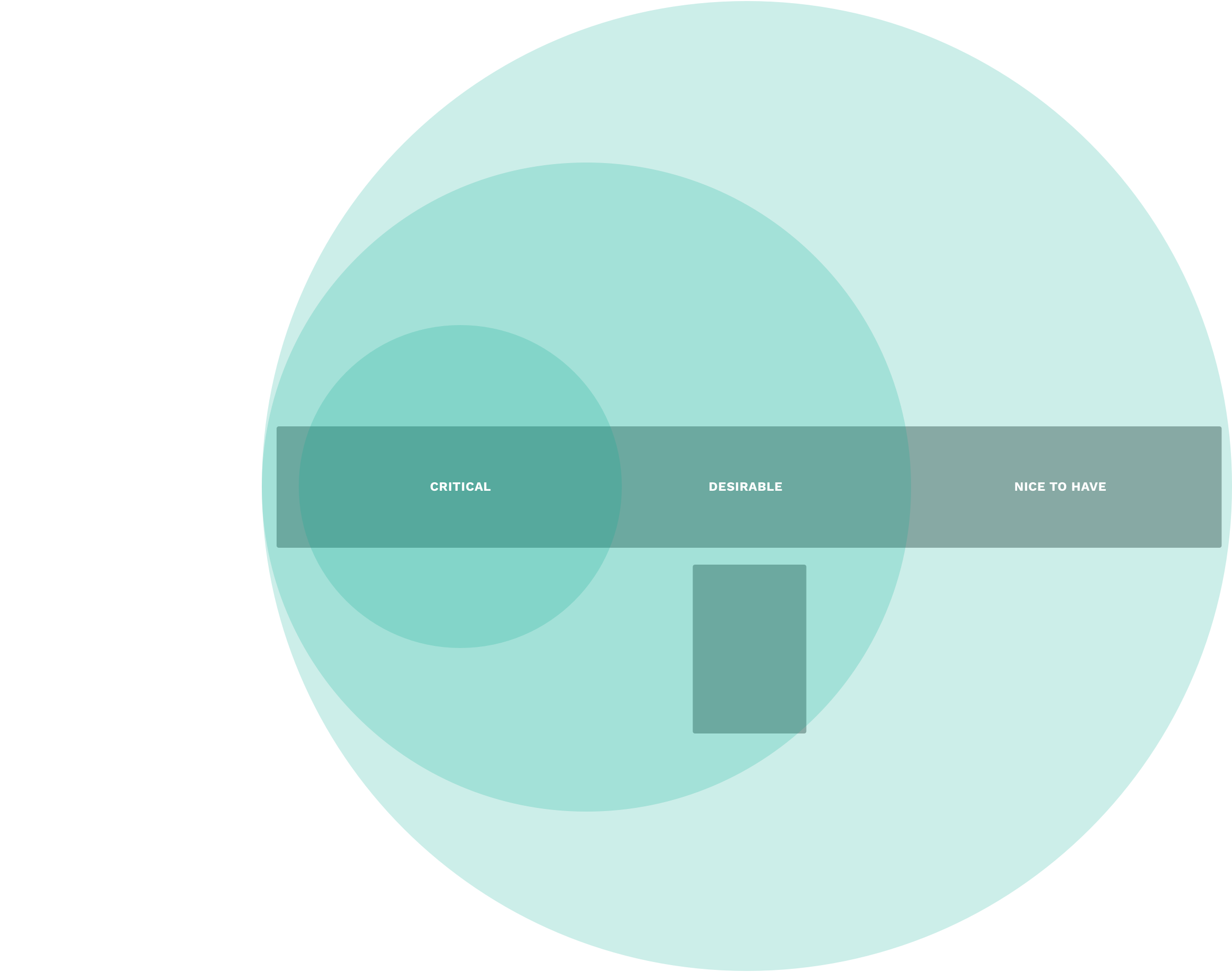
Guiding PrincipleThe level of importance given to content directly correlates to distance from driver.
Initial Sketches for Panoramic Display + Touch Screen
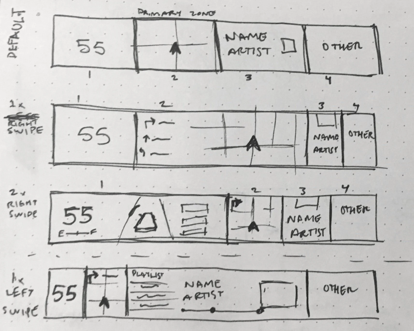
Starting with an even distribution of Cluster Info, Navigation, Audio, and a Fourth content choice, the concept was that the user could swipe left or right on the touch screen to push and pull one of the four content spaces into a larger footprint.
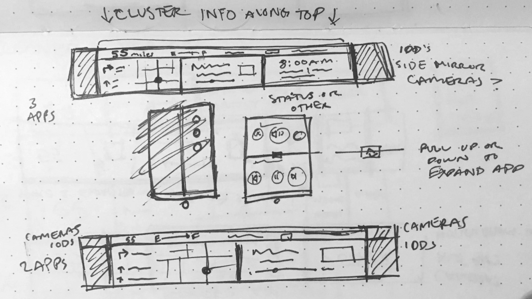
A more static concept with side camera views on the far edges, and Navigation, Audio and General time/weather details evenly distributed into thirds. Along the top of the screen in a thin band would be Cluster info like speed, gear, etc. Finally, the touch screen would have basic content controls for Navigation and Audio, and a middle pull tab to expand or collapse the Navigation or Audio app.
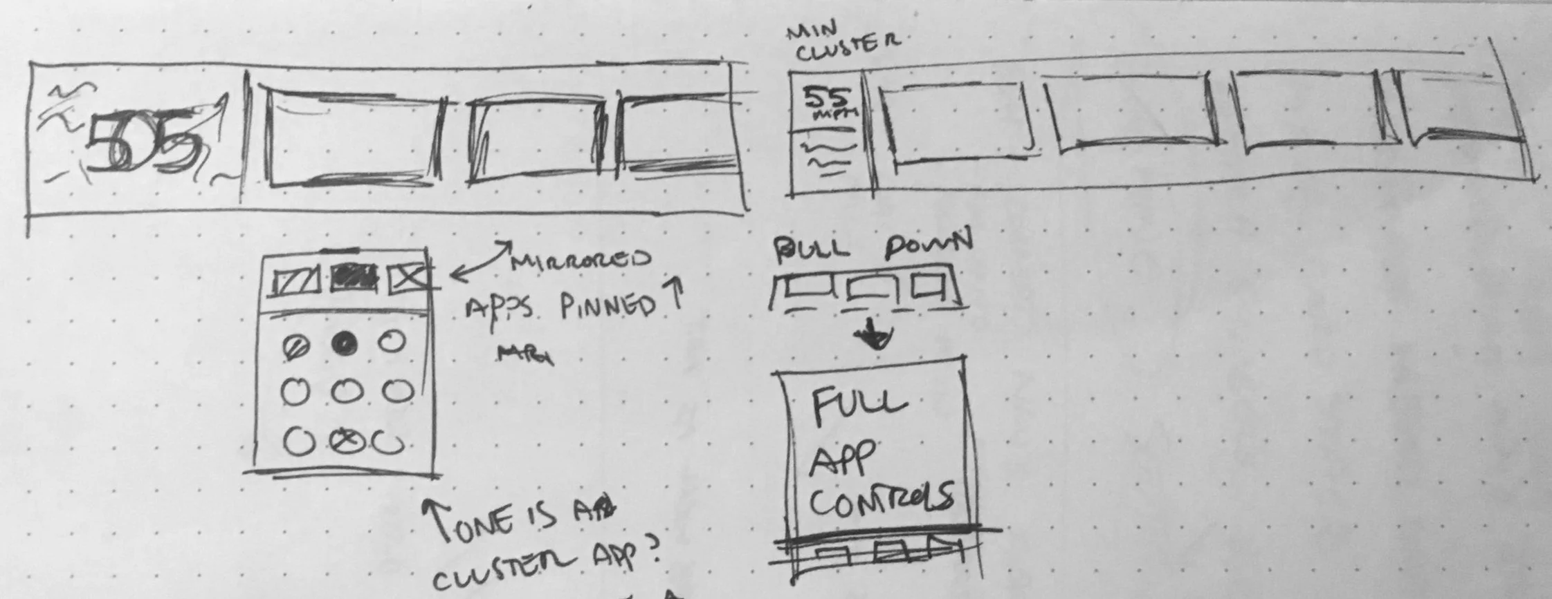
This sketch concept allowed for more personalization by allowing the user to choose which apps they wanted to "pin" into the panoramic display.
Testing New Interaction Methods
Concept APinned Favorites
This concept allows users to choose which apps they see in the panoramic screen. From the app menu in the touchscreen, a user can drag and drop an app into a mirrored widescreen bar along the top of the screen. Pinned apps will always have readout in the widescreen (until that app is unpinned). Opening a non-pinned app will be shown only in the touchscreen.
Concept BCurated
This interaction concept reacts to user tasks and outside events. Content is fixed in predetermined zones. The level of detail can be tweaked to a driver’s preference from the touchscreen (i.e. Show/hide turn-by-turn directions, show/hide full map, show/hide album art, etc.) This lightweight system is designed so that the user has what they need when they need it.
The rest of this project starts to tiptoe around NDA territory because it contains more brand identifying design language. However, I would love to share more of the design work in a non-public setting and talk about my experience testing and validating these final designs in Shanghai.


